
I'm Rachel. This is my design portfolio & blog.
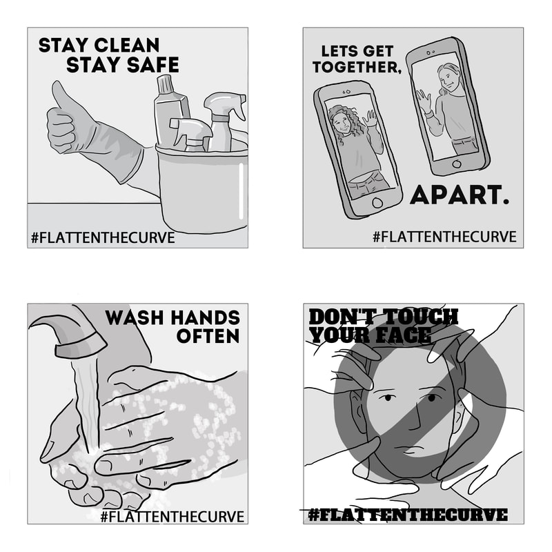 With the recent virus outbreak, we were asked to design some safety posters to help individuals prevent the spread of COVID-19.
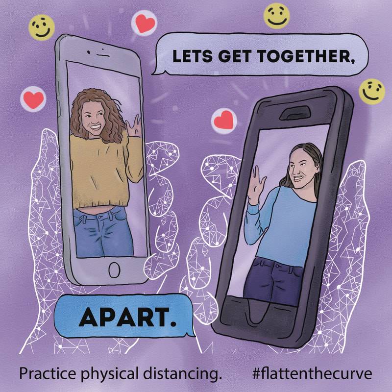
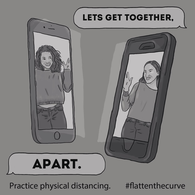
Reminders; Stay clean. Disinfect high-touch surfaces. This includes, but not limited to; toys, toilets, phones, electronics, door handles, bedside tables, television remotes. Practice physical (social) distancing. Limit your social interactions to phone calls, video calls, or by using any other interaction platforms. Wash your hands.Wash with soap and water for 20 seconds, especially after using the washroom or preparing food. Avoid touching your eyes, nose, or mouth with unwashed hands. Stay home, stay safe. Lets flatten the curve. This week, I worked on adding color to my 'Alice in Wonderland' storyboard. Each frame was created in photoshop. To color each image, I worked with MANY layers to keep clean and organized.
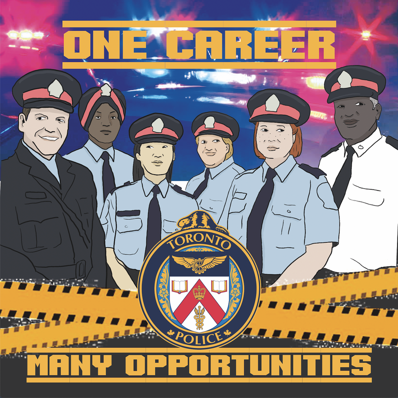
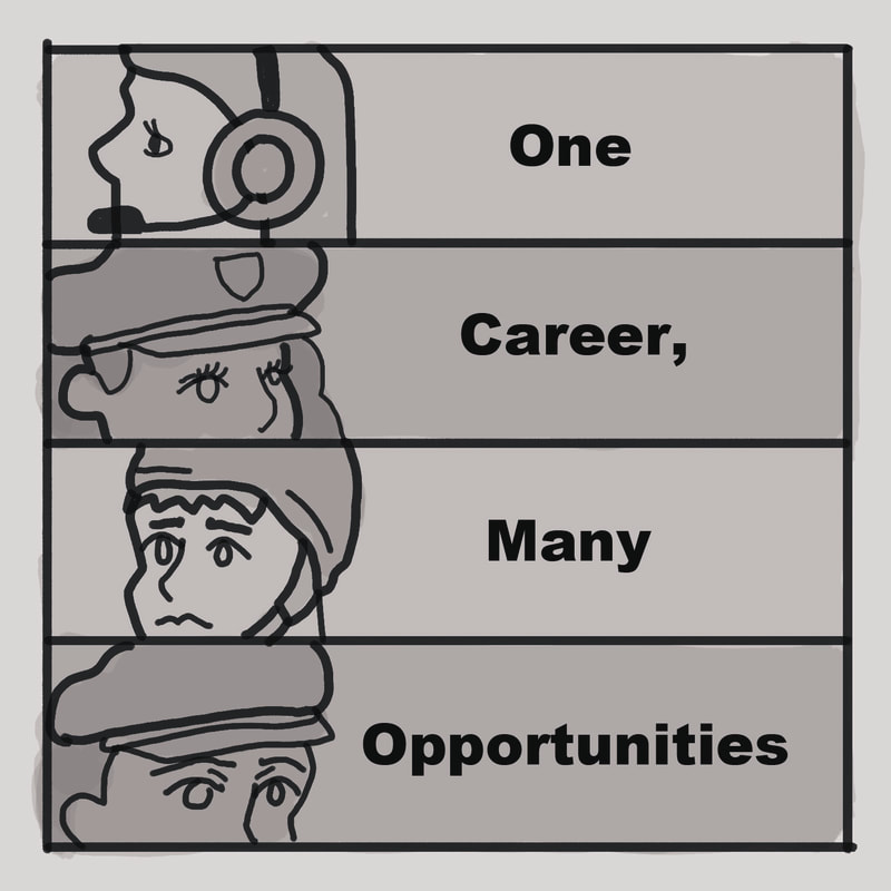
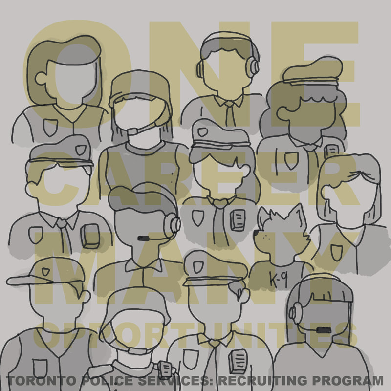
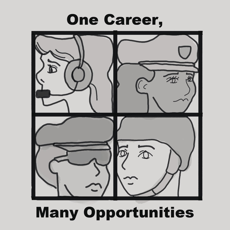
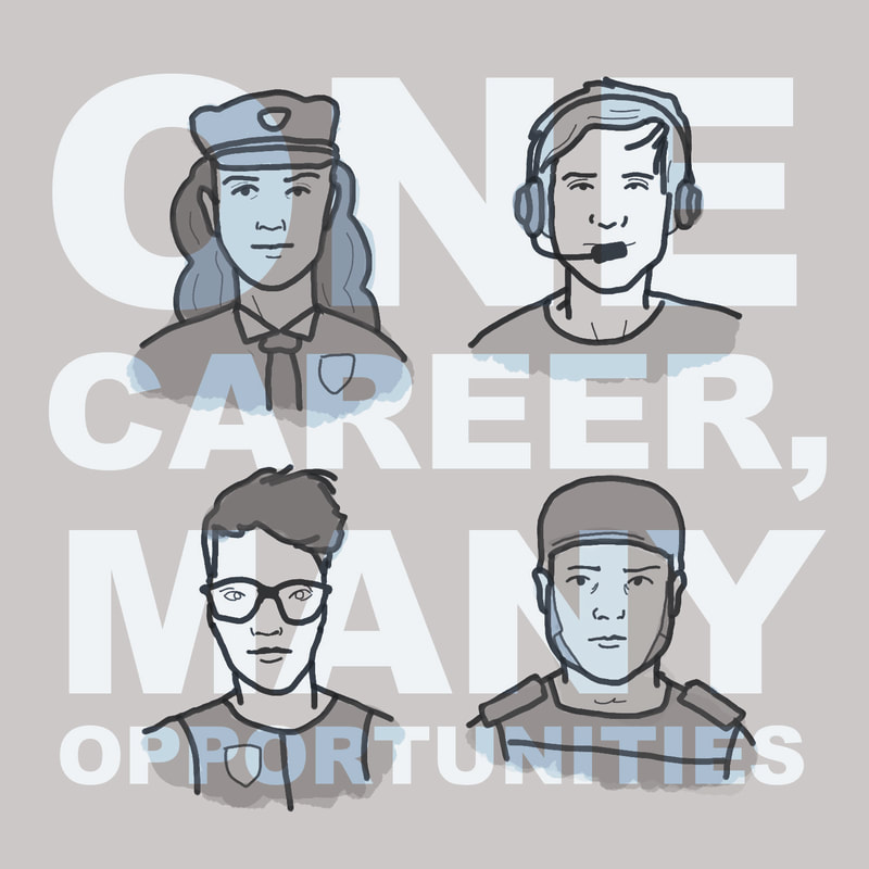
I began my paintings with simple colors. I had nearly each color as its own layer. This allowed me to do quick strokes and easy erasing to keep things in the lines, without worrying about erasing a color I did not want gone or having to do back over a color to touch it up. After I had my simple base colors added, I add a layer to create some shadows. I started my shadows with a simple dark circle around the edges to put the focus on alice. I used a low opacity black brush and went over repeatedly until I created a circular gradient. I added a layer mask of color burn to allow more of the color underneath to show through rather than having just black. I also added simple shadows within my painting where light falls off. I did this by slowly blending two colors back and fourth with a low opacity brush. Lastly, I added my highlights. This was done simply with just a low opacity white brush. I added strokes wherever the light would hit. 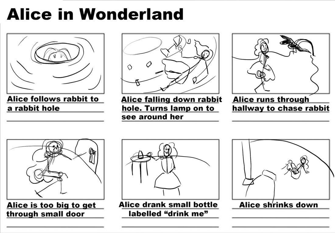 This week, I worked on a storyboard sequence to a short scene of Alice in Wonderland. I started out by creating a (very) rough thumbnail sketches of how each storyboard will look. After my thumbnails, I worked on turning those thumbnails into line art. I started my final design with line art. I continued by adding a layer for a variety of skin tones. On my next layer, I added in all different hair colors. Followed by a layer for clothing. Each layer consists of low opacities building up until i find the right tones and colors. 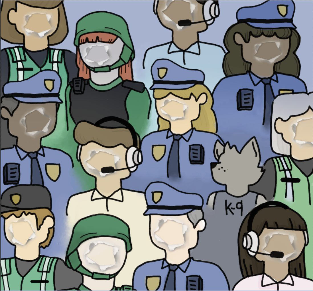 Next I added in some texture by adding in a piece of paper with a hole in it. I placed in on the faces of all my people to give a visual of 'what's underneath' 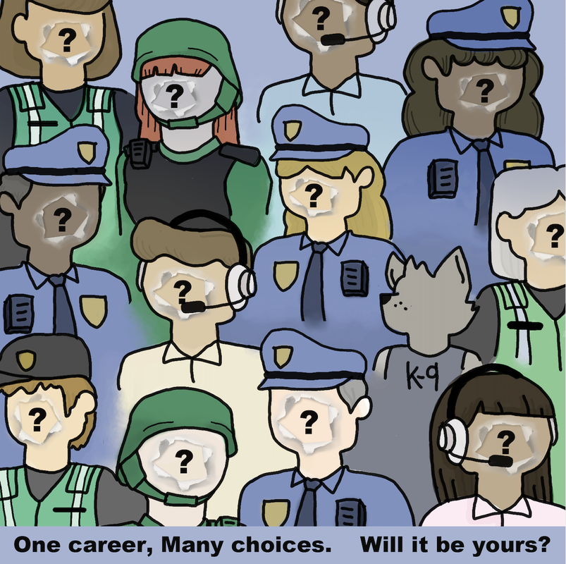 Lastly I added some question marks to the middle of each face along with the caption "One career, many opportunities. Will it be yours?"
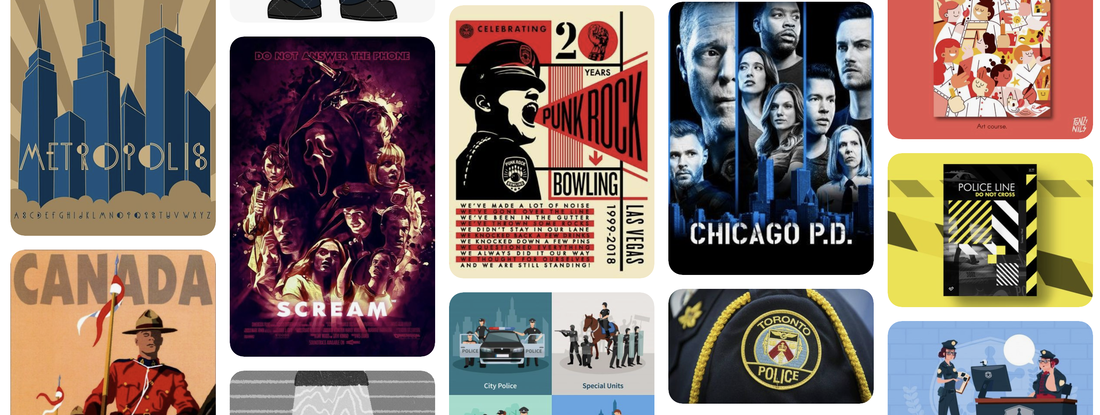
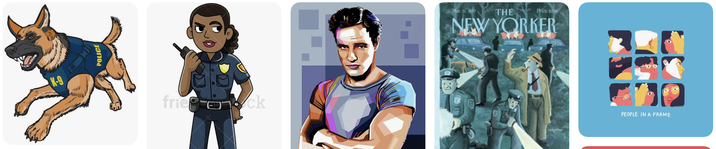
This week, I worked one some thumbnail sketches for the Toronto Police Services: Recruiting Program. This week, I am beginning brainstorming a digital illustration for Toronto Police Services recruiting program. To begin my brainstorming, I created a mood board with images I can use as inspiration: Using these, I began sketching up some of my own illustrations: 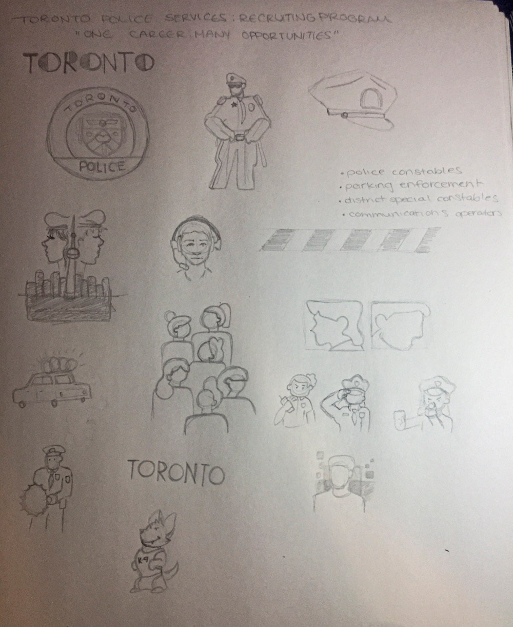 Next step: Thumbnails. Stay tuned for more.
This week I worked on finishing up my Grim Reaper storyboard. For each frame, I used the same brush and technique to have a consistent style. I painted each frame with a low opacity and continued over and over until I reached a darkness I enjoyed, while also giving the look of the room getting darker the father away from the candles it got. |
AuthorWelcome to my blog! My name is Rachel Mitchell. I'm a 21 year old artist and graphic design student at Mohawk College. ArchivesCategories |
 RSS Feed
